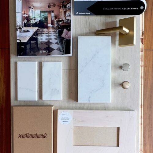
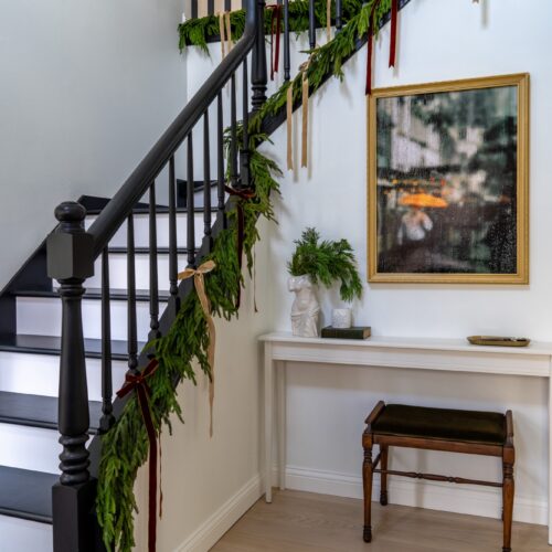
We’re finally ready to move to our kitchen renovation, something we’ve been scheming about and planning since the day we moved into the house about 6 months ago now. During the home search, having an upgradable kitchen that either was already large in size or could be easily expanded was our number one criteria. We got lucky and in general our kitchen layout is very functional, we’ll of course be making some tweaks but no major layout changes. If you want to see some of the before photos of our kitchen, you can check them out in this blog post.
Onto the kitchen design! I (Lauren) am an architect so I designed our kitchen myself, creating both floor plans and interior elevations for each of the walls in the kitchen. I also created a 3D walkthrough which you can watch through the YouTube video linked above!
Personally, I don’t feel like a kitchen layout or design is something that should be rushed. Like I mentioned, we have been working on this design for months. There have been many evolutions and each time, to us, the kitchen design improved. This also gave us a lot of time to collect inspiration images, research products and appliances, and study the details in kitchen designs that really resonated with us.
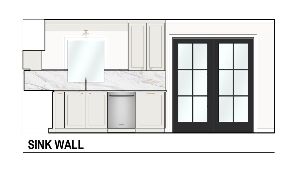
We’ll start at the sink wall. Again, no layout changes here aside from trying to get rid of the existing soffit if at all possible (we’re still not sure it can be removed yet because there is plumbing in it, so we’re designing for the worst case scenario). We’ll be replacing all of the existing cabinets and work to maximize storage. We’ll be replacing the countertop with a slab backsplash in either quartz or porcelain. We will also be replacing our existing patio slider because it is in rough shape and it’s a good opportunity to upgrade the look of it.
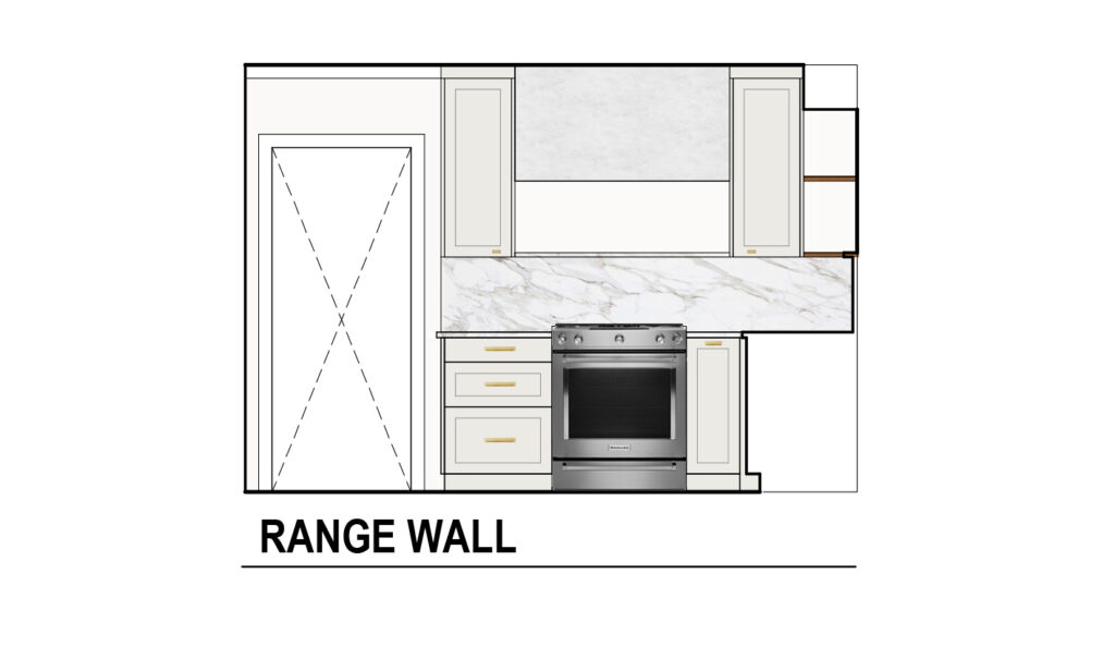
Wrapping around to the range wall, this was the trickiest wall in our kitchen to plan. The existing footprint of this area is tight, I originally wanted to do a larger professional range but quickly realized that nothing over a 30″ range made sense. Therefore, I was challenged with trying to make the stove niche seem larger than it actually is, so we opted for an oversized custom vent-hood. We are showing at the vent-hood at 48″ wide, the size of professional range so it gives the area an upgraded look and becomes a focal point in our kitchen. We haven’t yet finalized the details of the vent-hood but our first thoughts are to either use a venetian plaster or lime wash.
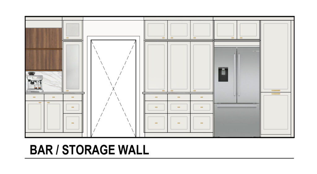
Onto what I believe is going to be our favorite area of the future kitchen, the bar and storage wall. Pantry space is really important to us because we cook almost every single day. We have a lot of food and kitchen gadgets in our kitchen! To the right of the refrigerator we’re going to have a 24″ full height appliance pantry (I am so excited for this to keep everything organized!). To the left of the refrigerator is our new 3.5′ wide pantry area, which consists of lower cabinet drawers and shallower cabinets sitting on-top of the countertop. We’re really looking forward to organizing and customizing our pantry and we feel the shallow cabinets will really help keep everything in the pantry very visible.
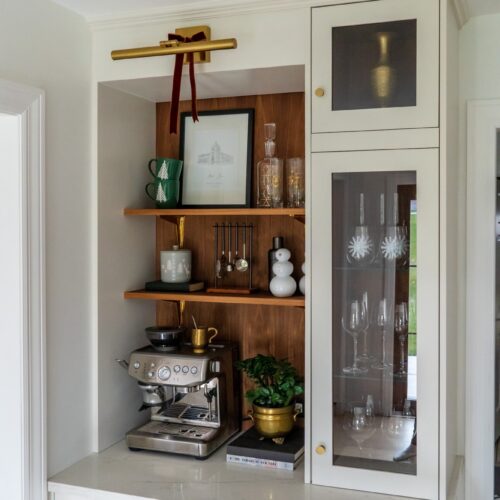
As for the bar wall, I had to take any opportunity in this kitchen to have a designated coffee and bar area. This area was previously a built-in desk (hello 90’s kitchen!) which we were never planning to use. We’ll have another cabinet sitting on-top of the countertop but this time with glass fronts to display all of our stemware. The rest of the area will be open shelving and allow for a spot for my coffee machine and all of our bar accessories.
We’ll finish out the kitchen with an expansive 10′ island running down the center that is half cabinetry and half seating. It will be the perfect place for cooking prep and socializing. The next steps for us include packing up our cabinets, setting up a temporary kitchen in the dining room and then moving onto demo! We’ll continue to share in more detail the process and all of the products we’ll be using to complete the kitchen renovation, so stay tuned!
